I support your choice too.
Yeh, I like monsters better as letters.
How complete is this tileset? Is it ready to be packaged with the next release?
It’s gorgeous, love it. I still like the symbolic approach of letters of console roguelikes rather than the micro-sprites but they look very appealing to the retro style.
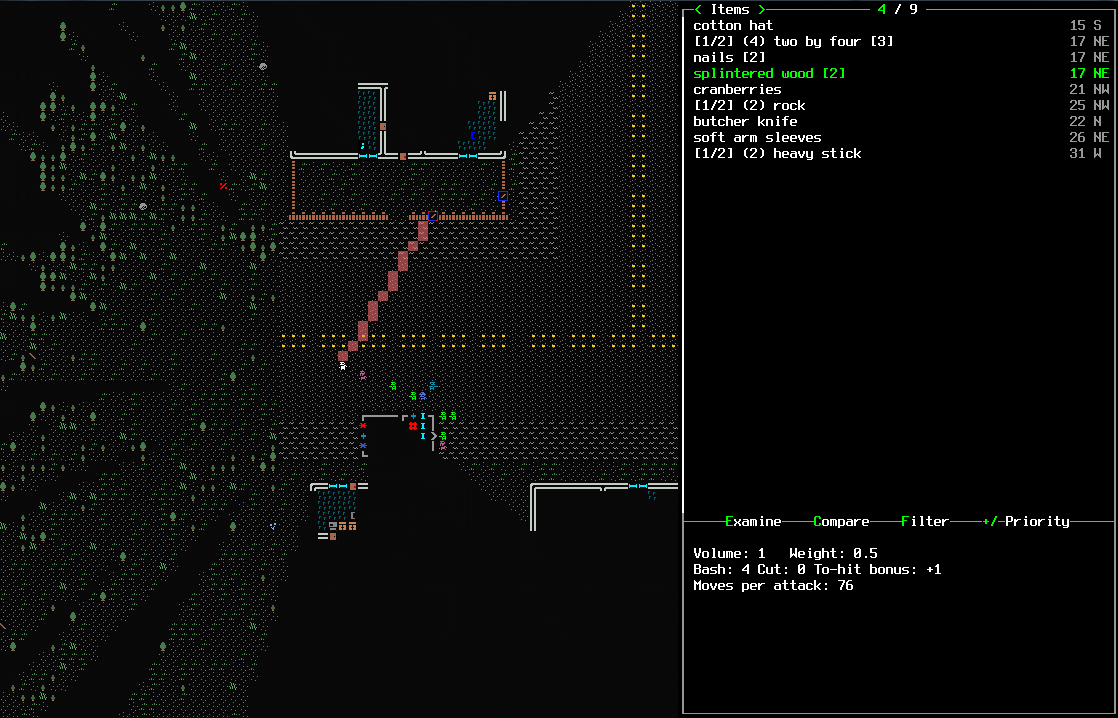
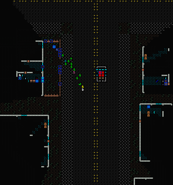
Call me picky but the combination of dark grey background with the grey dots in the road strains my eyes a little, almost like a moiré effect.
If I remember the grounds in the Spectrum-like graphics tended to include less color dots and leave more black background to let the image breath a little, mostly if the pattern is repeated a lot as in this case. Have you tried to lessen the number of dots or at least, experiment a little to optimize them?
The rest of the tiles, house, items and such are perfect. Kudos.
Likewise, I love the tiles but dislike the monster and player sprites - if not letters then something more symbolic would work better imo
It’s not complete. It’s usable but I only converted the most common stuff you see around. I usually just load ASCII and tiles and then convert the stuff I stumble on.
Before I start the busywork of going through all the object files, I’m waiting that tile mode gets the needed fixes. Like the (V)iew menu and some other things that are displayed differently between ASCII and tiles (like smoke). With things changing every day it’s not that convenient to complete the tileset only to have to change everything again. But before things stabilize programmers need to do the programming, and now I read that some fixes won’t likely be ready for next version.
IT’S KIND OF A BIG DEAL.
What is that people don’t like about the sprites? Because they are too tiny? What tells them apart is mostly just the color, so I don’t see using sprites all that different from using letters. Zombies all use a “Z”, so you use color to tell them apart. In my tileset you STILL use the color, since the sprite may be too small. But there isn’t a loss.
If they are too tiny see this, which is a good compromise for me:

If it’s instead just a preference thing I could make optional tiles with just letters. I also prefer clarity, but in this case there’s really no difference.
Yes, can it be official? It’s breathtaking.
Latest versions supporting view menu and other fixes:
http://www.cesspit.net/misc/10x10.zip
http://www.cesspit.net/misc/15x15.zip
http://www.cesspit.net/misc/20x20.zip
This is great. And I for one quite like the zombie sprites. The girl sprite is great too, distinct, it’s amazing how much you (or the artist) managed to convey with so little. I can’t praise you enough, this will most likely be the one I eventually use.
I will echo the criticism regarding the color change, however. I find the darker colors of the first screenshot, not only the black, easier on the eyes. Though, as you say, it depends a lot on how one’s monitor is set, and I understand I could just personally change them later on for my own use.

I’m… not sure either. But I feel the doors match the double lines better.
I like this new wall more, good job!
Yes. Thick walls better than single or double.

Here, you can use these if you want to change the car layouts…
I only need to make 'em larger so they fit into the 8x14, or 8x15 pattern for the screen font.
This looks quite cool… My only concern would be that it might feel a little overwhelming, that the low pixel density might be interpreted as heavy detail by your eyes. But it’s a gorgeous style that I don’t think I’ve ever seen an equivalent of.
Oh. My. God.
It looks just like a game running on the Spectrum.
THIS MUST BE IN THE MAIN PACKAGE
I find the darker background better as well, but I also really like the thick single line walls.
I really like this tileset. Once it’s done it’s gotta be in the main package.