Last update:
All code is now merged, so both ASCII png (using a font png) and ASCII fallback (showing ASCII whenever a graphic tile isn’t defined) are in the last experimental.
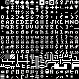
This is a small package that includes the required .dlls (otherwise you’ll get crashes) four ASCII sets (9x9 used by default, a 8x8, a 10x10 and a 15x15), and my last tweak of RetroDays tileset with built-in ASCII fallback. Plus my color definitions.
By default the game will run in a 1120x736 window with standard Terminus font for UI and a 9x9 ASCII set for map graphic. To switch to graphic tile just use the game option.
To switch UI or map font you have to edit /data/fontdata.json
To change default colors /data/raw/colors.json
http://www.cesspit.net/misc/asciitile.zip
The file should be unzipped in the main Cataclysm directory after you unpack the latest experimental: http://ci.narc.ro/view/Cataclysm-DDA/job/Cataclysm-Matrix/Graphics=Tiles,Platform=Windows/lastSuccessfulBuild/


[hr][hr][hr]
I was posting updates on the announcement thread since I’m relying on the most recent patches and not the official releases, to test the new features of tile-mode. We still need a couple more things before the tile mode is actually well playable but I’m posting my experimental tileset here so that people who are interested can see it more easily.
It was originally based on just a 10x10 ASCII so that the map would use a square font, while you could use whatever Truetype for the normal text. Then I started editing things little by little, and more recently I’ve replaced some basic ASCII with some pretty tiles.
I’m now using a publicly available tileset and adapting/tweaking it:
http://csdb.dk/forums/?roomid=13&topicid=97045&showallposts=1&utm_source=buffer&utm_campaign=Buffer&utm_content=buffer7229f&utm_medium=twitter
As long I was just fiddling with things on my own everything’s fine, but I guess if we start using this more officially we should probably tell him and ask permission.
Anyway, whenever I update my tileset it pops up here, but consider this always need the most recent experimental/SDL build to work, and right now it replaces Deon tileset (since the files have those names):
http://www.cesspit.net/misc/10x10.zip
http://www.cesspit.net/misc/15x15.zip (bigger but aliased)
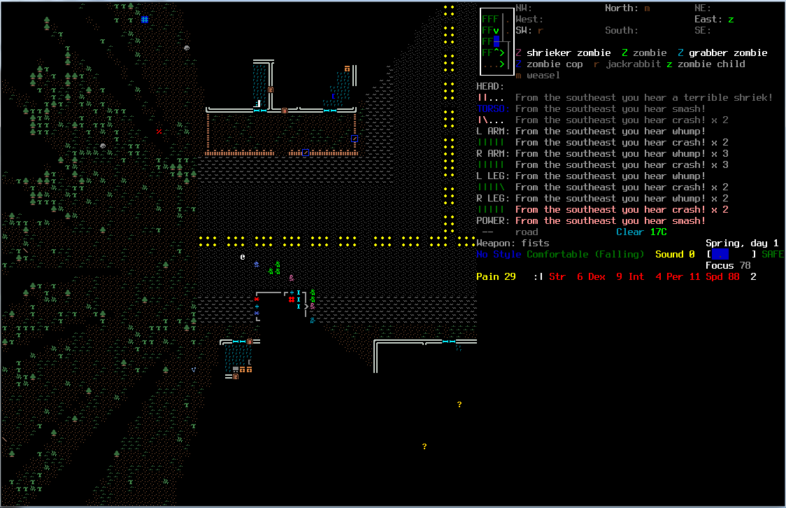
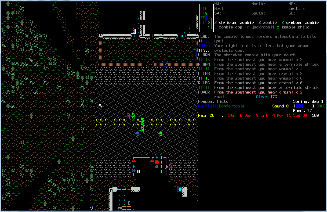
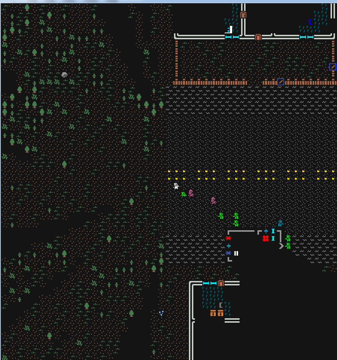
Theorycraft: standard tiles won’t work well with Cataclysm because it’s a cell-based game. You want to display a lot of screen, so tiles need to be small enough. At the same time if the tiles are small then you just can’t see them properly. Same issues of Dwarf Fortress. So ASCII mode is always better because letters are always easier to read than tiny colored pixels. Moreover: with tiles and “standard” graphic you get all sort of weirdness, like vehicles looking impossibly huge. But if you instead have icons instead of detailed sprites then everything looks nicer, because it’s a symbolic representation. In this case I mixed some basic tiles with ASCII trying to find a compromise between pretty and readable.
Latest stuff I added: redone the fences, doors, added variations between zombies types.
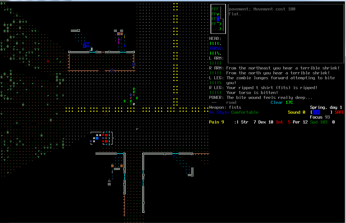
This is a screenshot from my recent version. Having a black background makes things much better to see compared to other tilesets:
Other experiments I tried was a 16x16 version:
And my standard ASCII: http://www.cesspit.net/misc/catatilelast2.gif
But for now I’ll stick with the version of the first image.

 Glad to finally see an official post for this sweet action, as well! I downloaded your older version and did some changing to it, but before I was even 20% through I saw the newer version and was blown smooth away
  Congrats and awesomeness to you and Trihook also
  Maybe he’d like to come here and massacre some zombs with us
 (as opposed to the guy sprite above)


