[quote=“Ice-o-metric, post:38, topic:5772”]WORK IN PROGRESS TIME!!!
Seen above, my first attempt at Pallisade Walls, Glass walls, Reinforced glass walls, and Fungal walls
At this point I’m just trying to get the shape and color correct, so i’d like everyone’s opinion on if anything needs to be changed before i use these as the basis for a more detailed textured version
Opinions anyone?[/quote]
It bothers me that the angle of the pallisade is different than the glass wall’s one, but what the hell, those are very good sprites.
By the way, I won’t have much if anything to say about the sprites themselves, I have very nearly 0 artistic ability, so please don’t take lack of feedback from me as a bad thing
Looks nifty so far. Just checking re colored walls: there are two different types. One is solid rock pillars that raise and lower in the Strange Temples; the other is painted walls in houses. Should be easy to tell apart as one uses lines and the other # signs IIRC, but thought I’d mention it just in case.
[quote=“StopSignal, post:41, topic:5772”]It bothers me that the angle of the pallisade is different than the glass wall’s one, but what the hell, those are very good sprites.[/quote]I tried doing them at full diagonal tilt, it was terrible… You couldn’t tell they were upright at all, I can show you the test sprite if you like
Does anyone want me to add any final details to the Palisade? Maybe a nailed board or some rope knots holding each log together?
[quote=“elauminx, post:39, topic:5772”]Palisade looks ok, perhaps give reinforced glass a grayish tint? and make normal glass less bluish at the same time…[/quote] Sounds reasonable, anyone else agree?
[quote=“elauminx, post:39, topic:5772”]I’m not seeing fungal walls, it may be because i’ve never seen them in real life ;-|[/quote]There’s so much room for artistic licence there its almost funny. I based it off the tiny flaps you see on the underside of a mushroom… But if anyone has a better idea, please post a pencil sketch and I’ll try to do it justice, otherwise I’ll do a more detailed version and hopefully it will look more organic
[quote=“Kevin Granade, post:42, topic:5772”]By the way, I won’t have much if anything to say about the sprites themselves, I have very nearly 0 artistic ability, so please don’t take lack of feedback from me as a bad thing :)[/quote]I never said it had to be Constructive criticism :-P… Besides, you know what they say Bad players can still make great coaches. But to be candid, I’m looking for feedback because it’s better to make a sprite most players will recognise than to just use one that I happen to like the look of.
Palisade walls use rope, so yeah, rope would be Nifty.
Reinforced glass having that wire mesh or something inside it would be great but grayer ought to work. Fungal walls are either a wall the Spire puts out as armor, or a slew of fungus growing from an existing wall. The cilia or whatever one finds on the underside of a mushroom probably isn’t the greatest choice, but wev. You’re drawing it, not me.
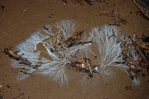
(FWIW the fungus is a nether variant of Cordyceps: tall and skinny 'shroom.)
Yeah, I always pictured the fungal walls as made up of mycelia masses, not the fruiting bodies.
More pictures of what the bulk of a “mushroom” fungus looks like, as in the bits that are not the fruiting bodies and are there all the time instead of just when it needs to produce spores:
If you guys like the basic design but want more layers of the thready tendrils i can try to do that, but this took quite a while and want to be sure i’m on the right track.
Things ought to be faster when i go back to the other tiles with a much more defined idea of what i want to do and how to do it
[quote=“elauminx, post:50, topic:5772”][me=elauminx]squints his eyes…[/me]
looks like a “right track”[/quote]
I took the basic design i made and applied a distinct round curve in the wall, but I had a hell of a time trying to find a lighting that portrayed it properly. If someone wants to make a crack at it i’ll happily hand over the working source: I was editing in GIMP… Otherwise it will do for the minute, since getting that right could take weeks or possibly months
SHOW AND TELL! YAY!
Once again, suggestions on improvement appreciated, let me know if any features look off and where
Wood cabin: doesn’t look right…
I think E wall should be symmetrical (also start the first log at the bottom) with the W, because as it is it gives an unfinished spiral impression, making the ground and roof half-log “start” and “finish” seem out of place… the ground might come out OK given some surrounding, but the roof breaks illusion too much. Otherwise it’s great… first try
Does anyone else feel the same way about the Log Cabin? (That is the way they work in real life, so that they stack better, but i kind of see what you mean about the half log looking wierd)
Also, I updated the other one… Your post Elauminx, had the unintended side-effect of making me realise that the sprite didn’t look like what i intended it to. And bore FAR too much resemblance to the glass walls (Not to mention, was the wrong size… 22 pixels, not 32! Must have been pretty tired or something), hopefully this is more recognisable.
It’s meant to be a plate-steel wall StopSignal… So, better than my last attempt, but still missing something.
This is perfect, because it lets me ask what would make it more obvious. Darken the metal plates? Make the long rods a rusted colour? Any other suggestions?
i have a couple of suggestions.
The log cabin have a sort of trip in the crossed wood.
is…weird, a lot. So it may be better with wood that comes out more.
Ok, that’s not totally aligned, but i dunno where squares are so… That’s just an example.
And for the metal wall, (and all other walls, imho) you should add a thickness.
A quick example (the detailed side is the one in the red square)
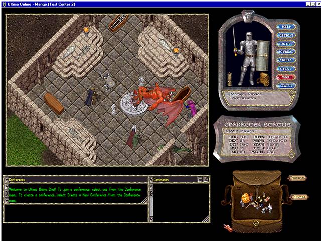
an example may be Ultima. It have all x and y axes turned, but the squared tiles are a good example.
Well, i always tought of that kind of walls as more or less like this:
Gray, not dark. With cables on them, things like that. Maybe the red thing is a good touch, but another, more greyish colour could be better maybe.
I really like what you did with the metal wall Flame. Like… Really like, I may have to borrow what you did as the basis of my next change to it, if you don’t mind


_mycelium_in_petri_dish_on_coffee_grounds.JPG)