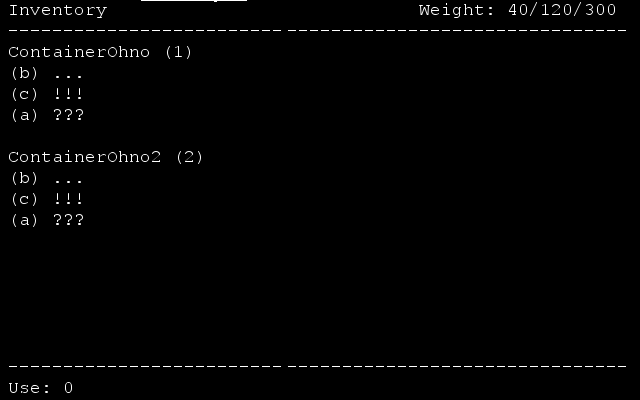
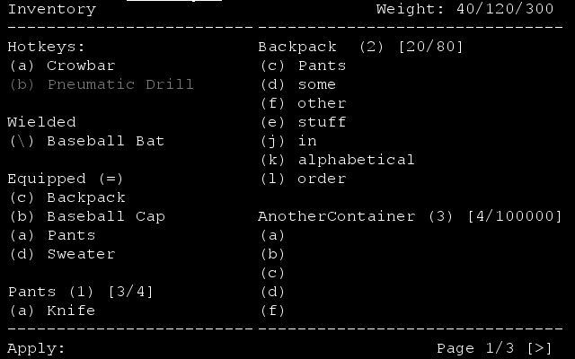
GlyphGryph's Reworked Inventory Handling Proposal

I’ve been through a lot of iterations of this, and discussed with a lot of other people, but I think this is the best system to implement. It’s a bit difficult to describe, but pretty intuitive to use. It’s a category-based fixed assignment double-key-access paging system. For these images, I’ve defaulted to assuming the categories will be containers, but this is NOT a core part of the proposal, and is based on the assumption that we may end up doing container-linking at some point. The proposal works just as well if the categories are the kind we have already have, but allows for a trivially easy switch to container linkage if we end up implementing that at some point.
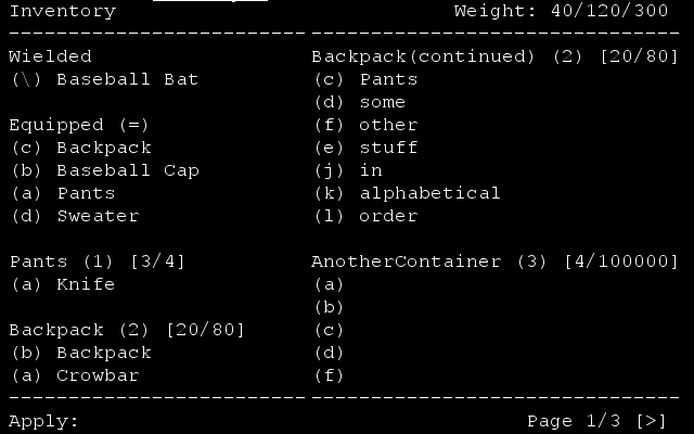
First, a description of the interface. In the top left is the menu title, and in the top right your weight concerns. If we use classic categories, inventory volume will also be located here as well.

In the bottom left corner is the buttons you’ve already pressed. First, the action key you used to access the inventory, and then any keys you’ve used to narrow things. Numbers come before letters, with the numbers represented the categories. More than 9 categories means additional categories will be prepended by zero (and, as an example of expansion, ADDITIONAL categories, however, unlikely, would be prepended by 00, and then 000. Not something we probably need to worry overmuch about though. Category 10 (which would come after category 9) would be written as 01. Category 15 would be 06, and category 19 would be 001.

In the bottom right corner is the current page, total number of pages, and paging keys you can press to do stuff, if needed. [<] pages down, and [>] pages up.

To select an item, you first press the key or keys for the related category, which will then narrow the screen to just items in that category. There may still be paging on this screen, though it is unlikely. When letters are assigned, if you have more than 52 items in this category, additional items will be prepended by 0, just like with the category screen, and if you have more than 104, 00, and so on. This seems relatively unlikely, though. But if you pick up 53 items in a category, the 53rd item picked up will be given the assignment “0a”. If you drop the first 52, it will still be “0a”, and you will press “0a” to access it.

When items are picked, they are added to this screen by taking the earliest available letter in that category, lowercase first. They are displayed alphabetically, however, not by this assigned number. Items will have a slight “memory” for this letter, and go back to it if dropped and picked back up (and the letter hasn’t since been taken), though this is unlikely to have much of an impact except on those who use throwing.

You can also assign “hotkeys” to certain items, giving them a letter. You can then access those items WITHOUT choosing a category - your hotkeyed items will be listed first as well as in their category and given direct letter assignments of your choice to access them. Items will always remember your hotkeys, and the hotkeys will stay assigned even if the item is dropped (visually, it will be greyed out) and picked back up, or changes normal access letter. The hotkey binding will only end if the item is destroyed or you manually change the hotkey.

Hitting an invalid value will be ignored. The backspace key will drop the most recent input.

When dropping items, if you have more than one in a stack, it will query how many you would like to drop. Either type in a number and hit enter to drop that amount, or simply hit enter (or the right number, or a larger number) to drop all of them.

For these images, I've defaulted to assuming the categories will be containers, but this is NOT a core part of the proposal, and is based on the assumption that we will end up doing container-linking at some point. The proposal works just as well if the categories are the kind we have already have, but allows for a trivially easy switch to container linkage if we end up implementing that at some point.
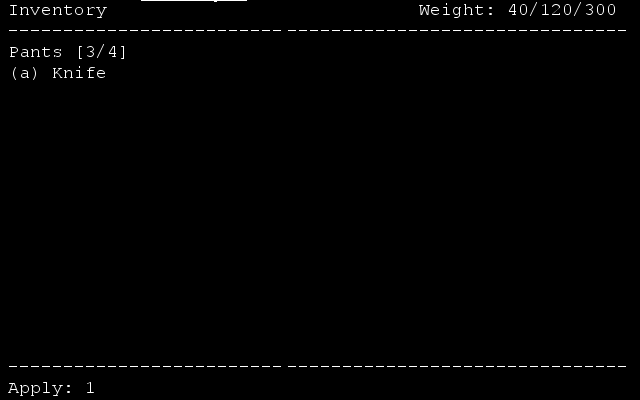
This is the important thing to keep in mind. Makes possible a smooth transition from arbitrary Categories (eg. Food, Weapons, Clothing, …) to a future container-based category system.

Some players - such as me - rely heavily on persistent item lettering. As such, I vote in favor of Gryph’s proposal.

Took a while to wrap my head around the navigation and glyphing system, though, but it’s perfect. Will be a lot easier when you have the screen under your eyes than trying to imagine it. ;p

It looks so much better than current system! I actually tried to think of at least some problems to bitch around, and make this post look “constructive”… well, i failed. Looks really good! When we can see it “live”? Maybe some test builds?

The only question remaining I can think of is ‘how are hotkeys assigned’, and should there be a way to switch access modes without leaving the inventory screen?

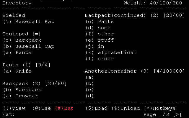
I figure it would be possible to have an additional row on the bottom, and from the standard inventory screen give it instructions for switching “modes”. Default “i” is ‘view’ mode.


(!) View . (@) Use . (#) Apply . ($) Eat . (%) Empty/Unload . (*) . Assign Hotkeys

(except with square brackets instead, but can’t write those here)

Good call. How about Drop as well ?

Yeah, there’s a couple more symbols, whichever modes we end up having. Drop would certainly be fine.

I’m currently in the process of rewriting the inventory code, and I’ll be using some of these suggestions, but not all of them.

I don’t want to give too much away, because it’s not all set in stone, but “inventory filtering” is a keyword. :wink:

I just posted about having ‘one’ inventory on another topic - Sorry for not reading thoroughly, it seems you’ve already thought of everything!
I think it is really counter intuitive for new players (especially ones new to RLs) to have to go out of the inventory to switch between action modes.

If possible, would you also be able to show what is on the ground directly below the player in a separate category?

Hmm… I’d actually go a bit further. There’s actually a few tiles around the player where they can use items for, say, crafting purposes. It would be convenient to have a category for “nearby items”. That’s actually a great idea.

Any item within 2 tiles, it uses the craft_inv function IIRC

Well it would certainly help me sort through my junk pile with crafting. 2 tiles hmm…

Also, I’m actually planning on attempting to implement this now. Been doing my C++ refresher. It seems like an easier task than the raws thing, and will let me warm up for THAT project, y’know?

That sounds great - glad to be of help! I’m sure you’ve already thought of this, but I suppose it might be difficult showing everything in two squares without it being a huge list (I’m nothing if not a hoarder), perhaps everything that isn’t in the inventory or directly underneath being on a different list/expandable list?
Really looking forward to this!!

I would really like to see a better way to stash stuff than to just dump it on the floor. I would like the ability to craft closets and chests. The ability to name them and change their color. So I can color code items.

I’d also like the ability to do a transfer all type. So if I have a gun cabinet, I can dump all my guns in it with 1 button and another for all ammo, etc…

I agree. I mentioned in a previous post, what if I have to ditch my backpack cause I’m being chased by zombies and I need the extra speed. Items could be linkable to containers, thus when you drop a backpack in your house, it could be full of one type of item. Or I could have backpacks setup for whatever I’m doing. Hunting contains a knife, a lighter, a frying pan, and some salt (preservatives). Scavenging backpack contains lockpicks, a flashlight, a prybar (a short crowbar), etc.