Topaz-8 10*10 works for me.
[quote=“Máté, post:21, topic:264”]Topaz-8 10*10 works for me.
Ah. Thanks!
EDIT: Unfortunately, not even that works. Probably should’ve tested it before thanking you…
http://imgur.com/a/yOHEO Theres my FONTDATA settings and the results.
I enjoy cootue’s at 16x16. Viewport at 28x28. Almost fullscreen on 1080p, leaves room for my browser toolbar.
This SDL (git, latest official) does everyting for me to maximize the screen, but the bar is there thus - not full screen. If someone worked a way around this please post.
Sorry if this is reviving a dead topic. But cootue’s won’t work for me anymore on .6
Anyone else having this problem?
Where did you put the font?
Not sure?
I installed it around the time of .4
Edited the FONTDATA file so it said “cootue_curses_squares16x16” (can’t remember the full name of the font right now, so if this is misspelt here, don’t worry, its right in the file)
It runs itself with the standard font now.
If you install it on windows, the name is cootuecursessquare16x16, if you put the ttf in font folder, the name can be the file name without .ttf extension (this is the easiest way to do).
Anyway, cootuecursessquare16x16 always work.
If you install new font (in data, data/font, or your system font folder), just delete fontlist.txt in data folder so the game can scan it again. This is not a must if you only want to use file name in data/font folder.
Ok I got it working, but the spacing looks wrong horizonally, like there’s too much.
That’s with typing:
cootue_curses_square_16x16
16
16
in FONTDATA
cootue_curses_square_16x16
16
16
16
Try this?
Thanks looks pretty good now. :3
I use Veramono 13x13
I had some interest in the White Rabbit I’ve been using, so I’ll post it here.
It looks nice at 1080p with 16x16 size.
You can find it at http://www.squaregear.net/fonts/
I hope you guys don’t get mad for kinda necroing this thread.
But, last night I spent like ~4 hours searching for a decent squarish free font for Cataclysm, this thread helped me and I’d like to share what I found.
Finding a decent one for high resolution desktop monitors that makes reading text pleasing and keeps the map as squarish as possible is kinda hard to get.
So I want to say thanks to Tal, because he obviously found one of the best… all other fonts I tried had something that felt wrong, White Rabbit Font is simply amazing, and even free (as in beer, I think even for commercial use, but Licenses is not my strong)
I just want to say if you are looking for a better font than Terminus, White Rabbit really deserves some attention.
The font was not designed perfectly square, has a 3:4 ratio (and I think that’s why text looks so good), but I even tried 16x16 (square), 12x24, 15x20 and 12x36 pixels and it still looks great! (12x12 didn’t look good tho)
I’m not an expert about fonts, but this font resizing and anti-aliasing works great in Cataclysm, while other fonts I tried deformed when I tried weird pixel ratios.
I’m using this in my FONTDATA, with a 1920x1080 resolution and a 32x23 viewport:
White Rabbit
15
20
Be mindful, square fonts makes the sidebar take a lot of space.
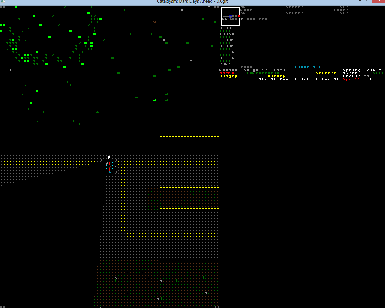
Some screenies to delight your eyes (click to get full size):


Hope it helps 
If I may necro the necro, where do I find ‘fontdata’? I don’t seem to have a file called that in my install.
I can’t seem to find it either, the devs must have removed it so we have to put up with awful non square distorted fonts.
EDIT:
It would seem you have to start the game for FONTDATA to appear, It should show up in Data.
That works, thanks.
You know what would be really cool? If someone did a ‘tileset’ that just copies the ASCII symbol for each tile. That should be straightforward to keep up-to-date with the experimentals (since each tile is only a few seconds to make) and thus avoid all the ‘unknown’ tiles you get by using a tileset with the experimentals, but let you have both square squares and nice-looking text.
(Rectangular font gives you rectangular squares but nice text, square font gives you square squares but nasty text, tileset gives you square squares and nice font but lots of ‘unknowns’. ASCII-tileset would combine the best features of all of them)
It’s been done already, I cant precisely remember who made it . But its basically a standard ASCII tileset with some minor graphics thrown in here and there to help distinguishment .
Most definitely don’t mind KurzedMetal, much appreciated actually!!
I had a hard time finding info on all this stuff even just on the web in general.
Hopefully this can stay a place for any to get a few pointers in the right directions.